UX Research & Product Design
Healthcare AI & Clinical Decision Support
Designing AI explainability for clinical decision-making in managed care.
Role :
UX Researcher
Tools :
Figma, Chat GPT, Notion
Type :
Independent Case Study
Duration :
4 Weeks

Problem: The gap between a model and a decision
A large government-sponsored health plan used machine learning to identify high-risk Medicaid and Medicare Advantage members. The models were already producing risk scores, care gap flags, and social determinants of health signals.
But adoption was near zero.
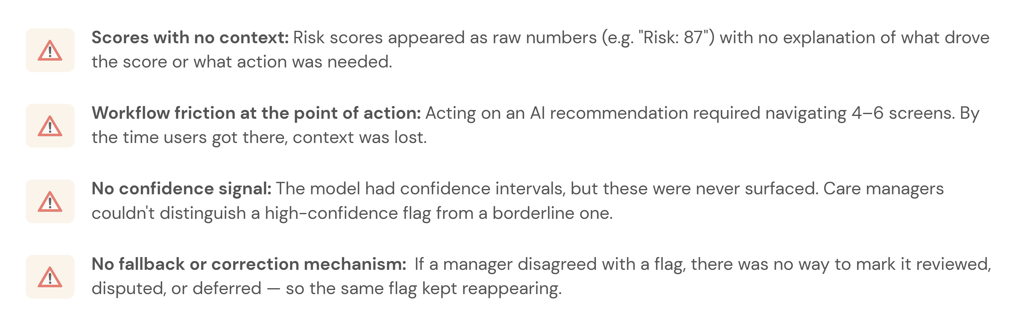
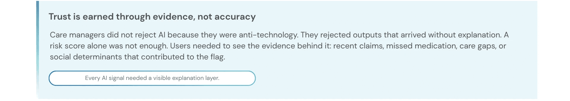
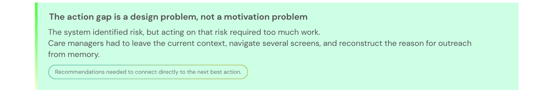
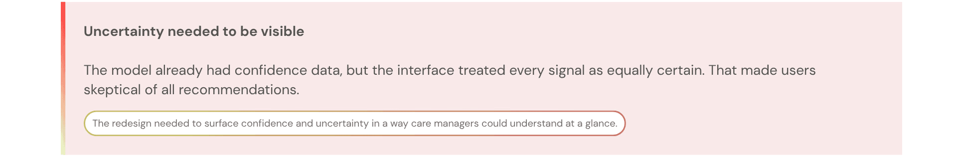
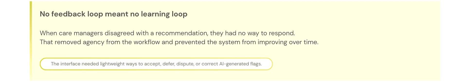
Care managers skipped the AI section entirely — not because the model was useless, but because the interface gave them no reason to trust it. Scores appeared without context, recommendations required too many steps to act on, and there was no way to challenge or correct the system.
This project asked a simple question:
How might we help care managers understand, trust, and act on AI-generated risk signals without adding more work to their day?
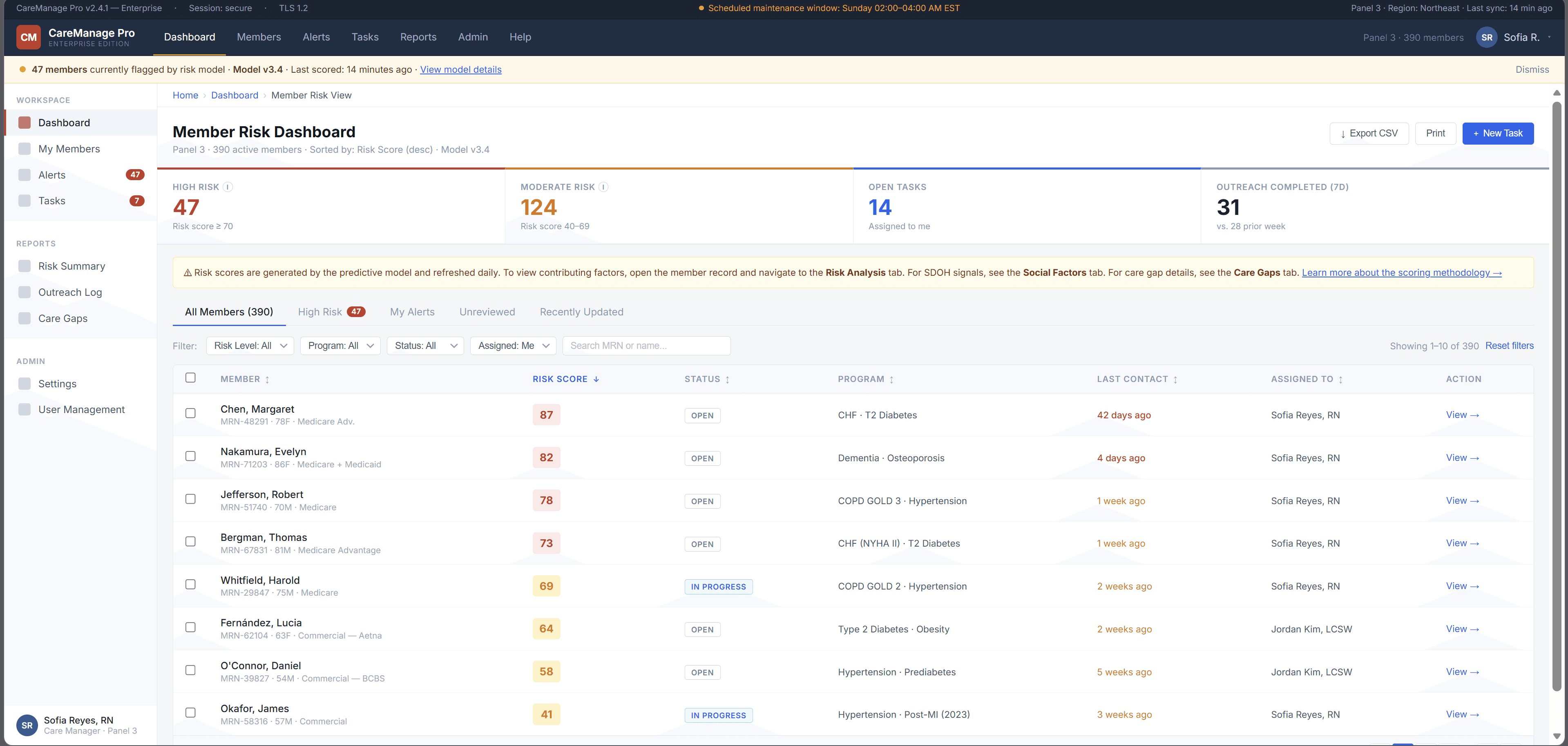
The platform was already running ML predictions in the background risk scores, care gap flags, social determinants of health signals. On paper, the system was working. In practice, care managers had developed a quiet habit of skipping past the AI section entirely and trusting their own gut.
The four things that were broken:
Research & Insights: How I figured out what was actually wrong
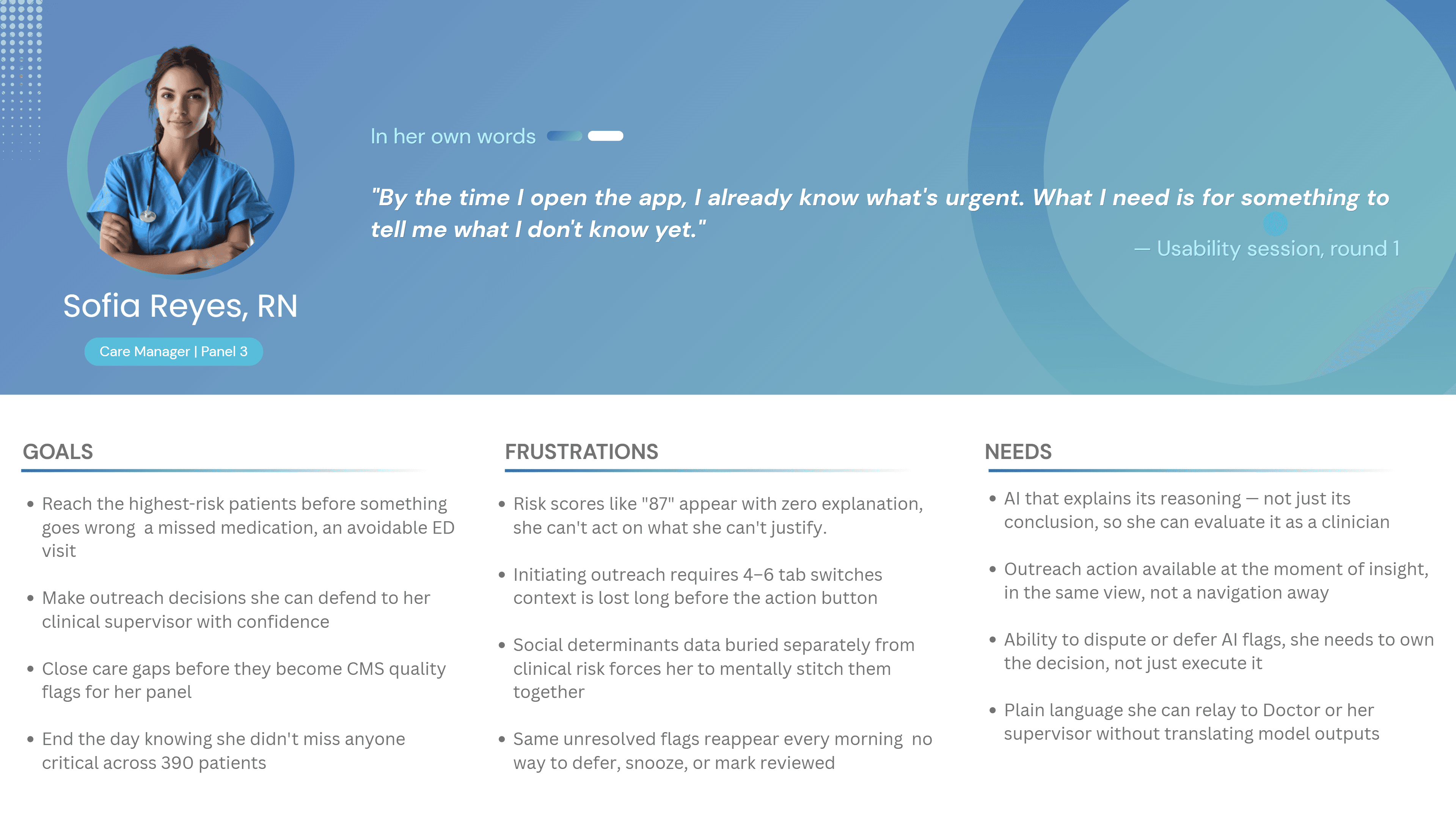
User Persona: Who I was actually designing for
What the research revealed
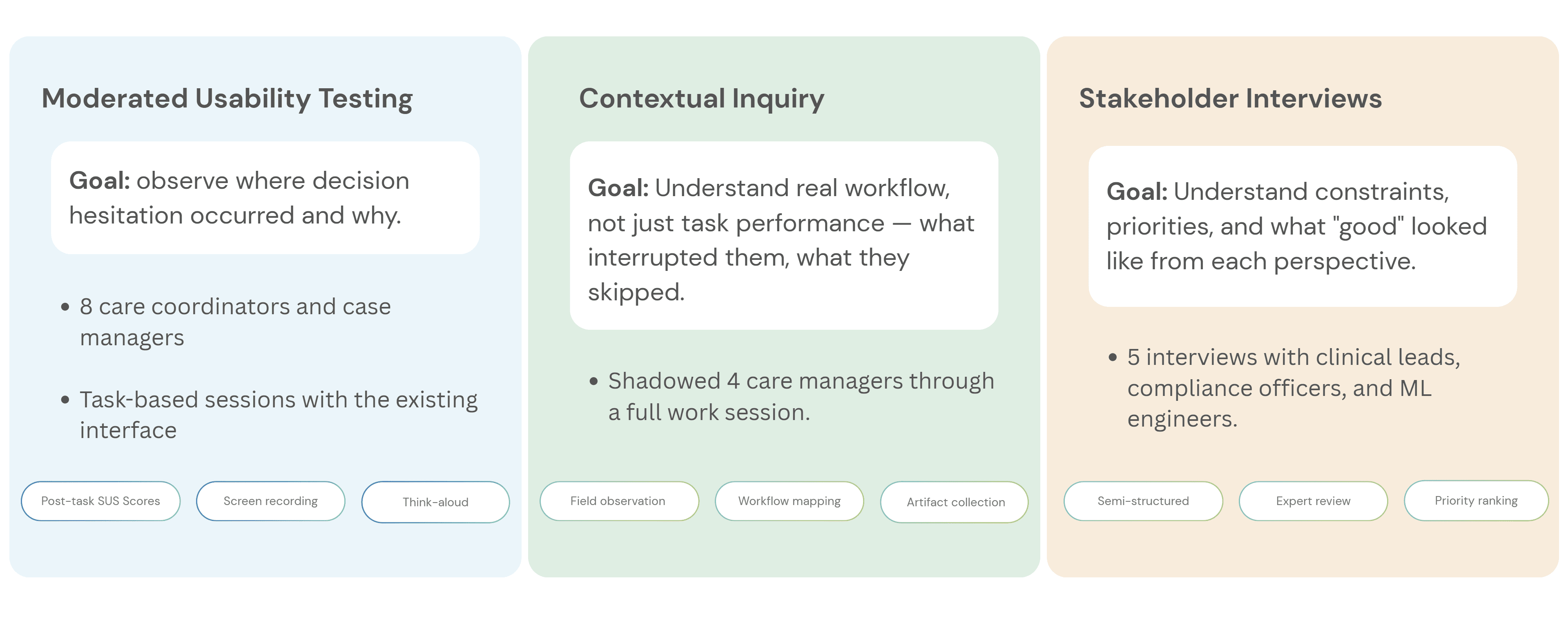
Before designing new UI, I needed to understand where the workflow failed. I ran three research activities, each focused on a different part of the adoption problem:
What I found — and what it meant for the design
Design Process: How the design actually came together
The redesign was not about making the AI more prominent. It was about making each AI recommendation more understandable, actionable, and correctable.
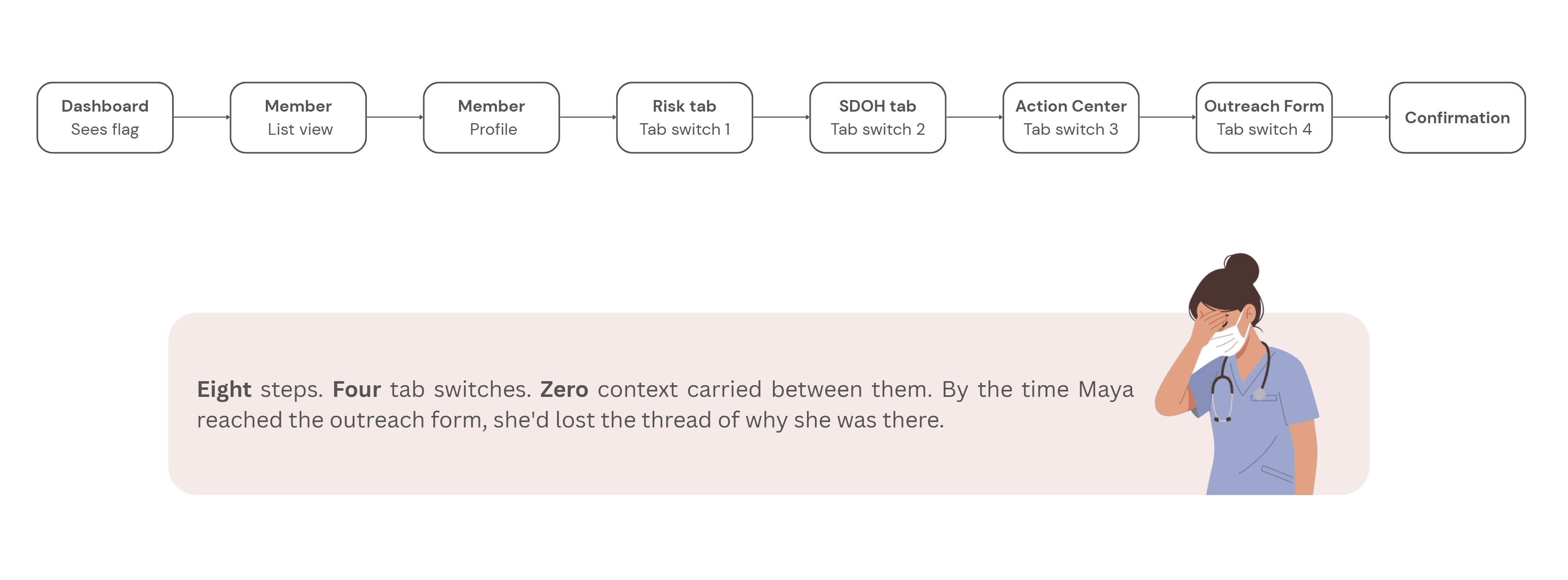
Step 1 - Mapping the current experience:
Before sketching anything new, I mapped what existed. The current user flow from seeing an AI flag to completing an outreach action looked like this:
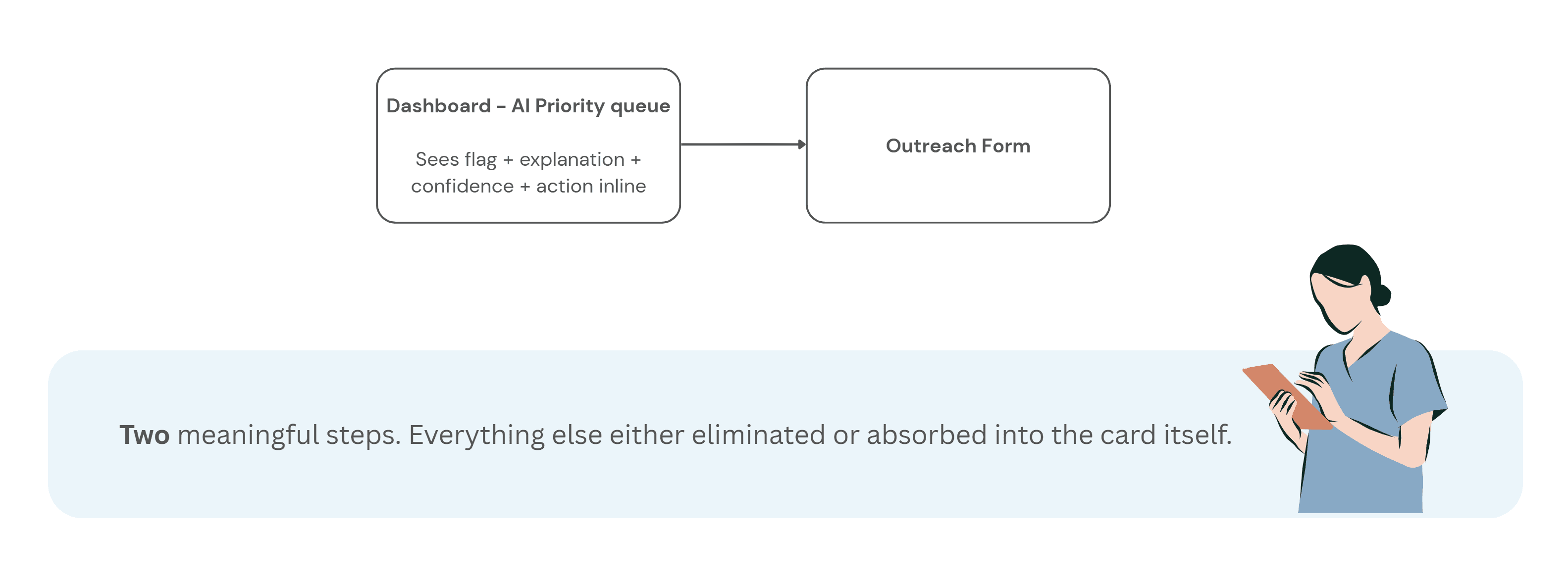
Step 2 - Reframing the flow:
With the research insights in hand, I ran a short synthesis session with the product manager and one clinical SME to align on what the redesigned flow needed to accomplish before any wireframes happened.
The target flow became:
See the flag → understand why → decide whether to act → take action without leaving context
This reframed the interface from a reporting dashboard into a decision-support workflow.
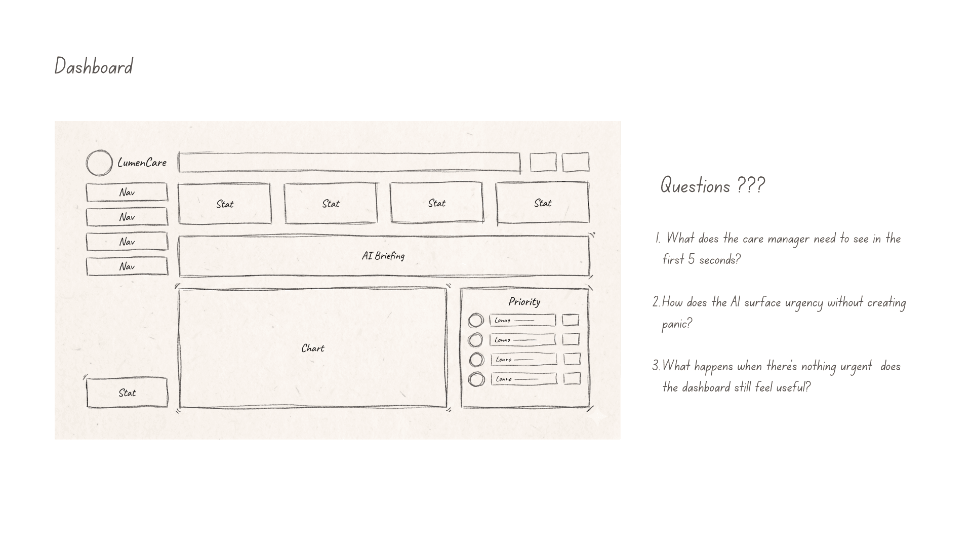
Step 3 - Wireframes
Early wireframes focused on one question:
Could care managers understand why a member was flagged without reading a long model explanation?
That led to a compact risk card pattern combining:
Top risk drivers
Supporting evidence
Confidence level
Recommended next action
Feedback controls
The goal was not to explain the entire model. It was to give users enough context to make a safe next decision.
Video- UI Prototype
Outcome: what the study showed
I ran a controlled usability study with 25 care managers. Each participant completed the same outreach task twice: once using the original workflow and once using the redesigned AI decision-support experience.
The task was simple:
Review an AI-generated risk flag, decide whether outreach was appropriate, and complete the next action.
Three measures were tracked:
Time to act on a flag
Usability rating using SUS
Percentage of flagged members selected for outreach
The redesigned workflow improved all three.
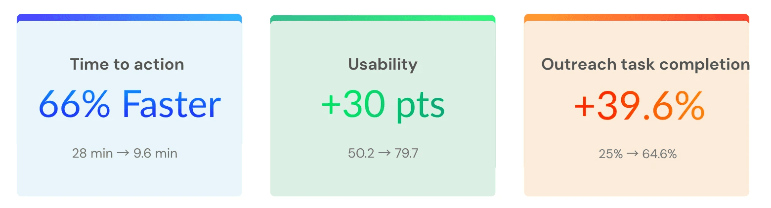
Study note : This was a simulated study dataset constructed to reflect realistic enterprise healthcare usability conditions. The goal was to evaluate workflow clarity, trust signals, and decision support patterns — not live clinical outcomes.
All identifying details have been withheld. Results from a controlled usability study using simulated care-management scenarios. Metrics reflect task performance, not live clinical outcomes.
What I would do next
The usability study showed that the redesigned workflow improved task speed, usability, and completion in a simulated care-management scenario. The next step would be validating whether those gains hold in production.
I would focus on three questions:
Does trust remain calibrated over time?
Does the workflow improve real operational outcomes?
Does the feedback loop improve the system?
The goal would not be to maximize automation. It would be to keep the system useful, transparent, and safe under everyday clinical pressure.


UX Research & Product Design
Healthcare AI & Clinical Decision Support
Designing AI explainability for clinical decision-making in managed care.
Role :
UX Researcher
Tools :
Figma, Chat GPT, Notion
Type :
Independent Case Study
Duration :
4 Weeks
Problem: The gap between a model and a decision
A large government-sponsored health plan used machine learning to identify high-risk Medicaid and Medicare Advantage members. The models were already producing risk scores, care gap flags, and social determinants of health signals.
But adoption was near zero.
Care managers skipped the AI section entirely — not because the model was useless, but because the interface gave them no reason to trust it. Scores appeared without context, recommendations required too many steps to act on, and there was no way to challenge or correct the system.
This project asked a simple question:
How might we help care managers understand, trust, and act on AI-generated risk signals without adding more work to their day?
The platform was already running ML predictions in the background risk scores, care gap flags, social determinants of health signals. On paper, the system was working. In practice, care managers had developed a quiet habit of skipping past the AI section entirely and trusting their own gut.
The four things that were broken:
Research & Insights: How I figured out what was actually wrong
User Persona: Who I was actually designing for
What the research revealed
Before designing new UI, I needed to understand where the workflow failed. I ran three research activities, each focused on a different part of the adoption problem:
What I found — and what it meant for the design
Design Process: How the design actually came together
The redesign was not about making the AI more prominent. It was about making each AI recommendation more understandable, actionable, and correctable.
Step 1 - Mapping the current experience:
Before sketching anything new, I mapped what existed. The current user flow from seeing an AI flag to completing an outreach action looked like this:
Step 2 - Reframing the flow:
With the research insights in hand, I ran a short synthesis session with the product manager and one clinical SME to align on what the redesigned flow needed to accomplish before any wireframes happened.
The target flow became:
See the flag → understand why → decide whether to act → take action without leaving context
This reframed the interface from a reporting dashboard into a decision-support workflow.
Step 3 - Wireframes
Early wireframes focused on one question:
Could care managers understand why a member was flagged without reading a long model explanation?
That led to a compact risk card pattern combining:
Top risk drivers
Supporting evidence
Confidence level
Recommended next action
Feedback controls
The goal was not to explain the entire model. It was to give users enough context to make a safe next decision.
Video- UI Prototype
Outcome: what the study showed
I ran a controlled usability study with 25 care managers. Each participant completed the same outreach task twice: once using the original workflow and once using the redesigned AI decision-support experience.
The task was simple:
Review an AI-generated risk flag, decide whether outreach was appropriate, and complete the next action.
Three measures were tracked:
Time to act on a flag
Usability rating using SUS
Percentage of flagged members selected for outreach
The redesigned workflow improved all three.
Study note : This was a simulated study dataset constructed to reflect realistic enterprise healthcare usability conditions. The goal was to evaluate workflow clarity, trust signals, and decision support patterns — not live clinical outcomes.
All identifying details have been withheld. Results from a controlled usability study using simulated care-management scenarios. Metrics reflect task performance, not live clinical outcomes.
What I would do next
The usability study showed that the redesigned workflow improved task speed, usability, and completion in a simulated care-management scenario. The next step would be validating whether those gains hold in production.
I would focus on three questions:
Does trust remain calibrated over time?
Does the workflow improve real operational outcomes?
Does the feedback loop improve the system?
The goal would not be to maximize automation. It would be to keep the system useful, transparent, and safe under everyday clinical pressure.